By the Team at Bombe.design
In the chaotic visual landscape of New York City, where every billboard, neon sign, and screen is screaming for attention, how does a politician cut through the noise? Zohran Mamdani’s recent victory wasn’t just a triumph of policy or grassroots organizing; it was a masterclass in visual communication. As designers, we often talk about “brand stickiness,” but what we witnessed in the Zohran campaign was something deeper: Civic Resonance.
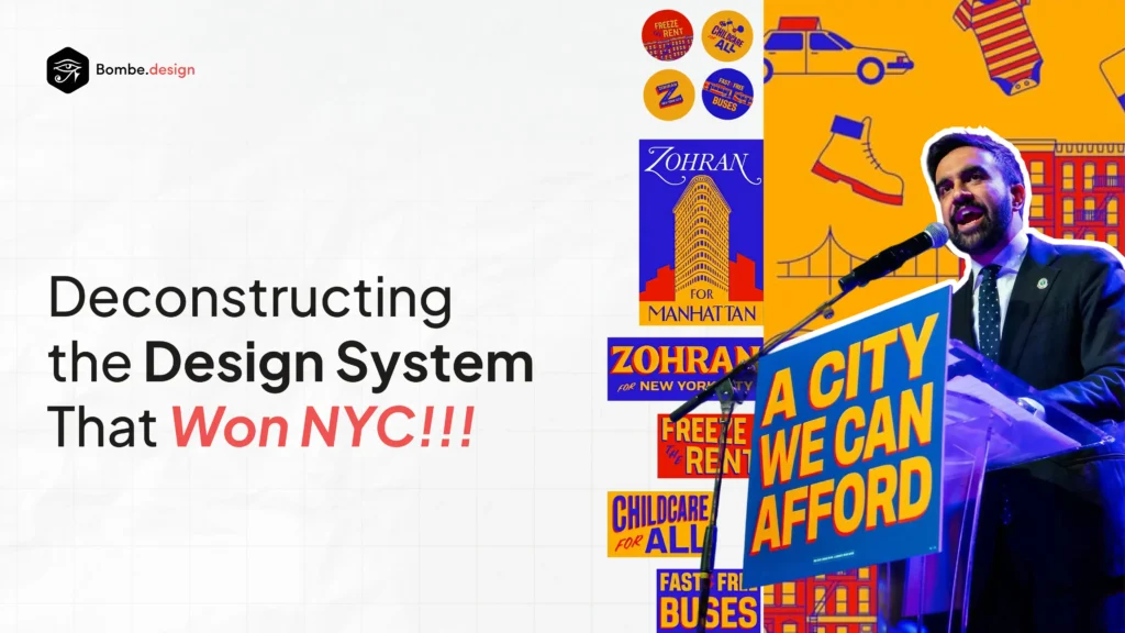
At bombe.design, we believe that UX research and study are very important not just for products or services but also for politics. Here is our deep dive into the design system, color theory, and visual strategy that turned a campaign into a movement. Let’s explore in detail.
1. The “User” Research: Understanding the NYC Voter
Before a single pixel was colored, the campaign understood their “user persona”, the tired, over-stimulated New Yorker.
Traditional political campaigns usually rely on “Trust Me” aesthetics: Navy Blue, White, and Serif fonts (think banks and law firms). This often signals “status quo” to a voter base that feels unheard.
Mamdani’s team did the UX research. They realized the user didn’t want a distinct “political” look; they wanted a “New York” look. The interface of the campaign needed to feel like the interface of the city itself.
2. The Color Story: Owning the Vernacular
The most immediate differentiator was the color palette. They rejected the patriotic red-white-and-blue triad entirely.
- Primary: Taxi Cab Yellow (#F7C728). This was the UX hook. Yellow is the color of urgency in nature, but in NYC, it is the color of mobility (taxis) and infrastructure. By adopting this high-vis yellow, the campaign visually co-opted the city’s streets. Every time a voter saw a cab, they subconsciously thought of Zohran.
- Secondary: Asphalt Black (#1A1A1A) Used for high contrast. It grounded the yellow, making the text readable (accessible) and stark.
- Accent: Bodega Orange & Neon Green Used sparingly in digital assets to disrupt the scroll on social media.
Why it worked: In a sea of blue suits, Zohran’s yellow posters didn’t look like campaign ads; they looked like public service announcements. They demanded attention.
3. Typography as Tone of Voice
The typography was the campaign’s loudest voice. They moved away from “safe” fonts like Gotham or Times New Roman.
- The Header Font: A heavy, condensed Sans-Serif (reminiscent of Druk Condensed or Impact). It was blocky, loud, and unapologetic. It mimicked the typography of tabloid newspapers and “Going Out of Business” signs, the actual vernacular of the street.
- The Body Font: A clean, mono-spaced typeface (like Roboto Mono). This gave the policy details a utilitarian, “receipt-like” feel. It signaled transparency: Here is the receipt for what we will do.
4. The Layout System: “The Sticker Strategy”
The genius of the design system was its modularity. The campaign treated their logo and slogans not as static headers, but as stickers.
- The “Z” Logo: Designed to be scalable from an Instagram avatar to a wheat-pasted poster. The “Z” was often enclosed in a circle or square, allowing it to be stamped onto any background image.
- Slogan Placement: Slogans like “Housing is a Human Right” were not treated as polite text at the bottom. They were treated as headlines, often spanning the entire width of the creative, edge to edge.
This created a consistent visual rhythm. Whether you saw an ad on a LinkNYC kiosk or a flyer on a telephone pole, the layout grid was identical: High Contrast Background -> Massive Typography -> Minimal Negative Space.
5. Digital UX: Scroll-Stopping Authenticity
On social media, the “polish” was intentionally stripped back.
In UX, we talk about “friction.” Highly polished, corporate graphics create friction for younger demographics; they feel like ads. The Mamdani digital team used a “Lo-Fi” aesthetic.
- Reels and TikToks: Text overlays were often native to the app, not exported from Adobe After Effects. This made the content feel native to the platform.
- Data Visualization: Complex policies (like tax reform) were broken down into simple, high-contrast carousels. They used the same yellow/black scheme to turn policy into digestible infographics.
Zohran Mamdani’s campaign stood out because it applied the core principles of human-centered design, not traditional political tactics. His team listened first, understood deeply, and built every message around real community needs, proving a simple truth designers know well:
Trust grows from listening, impact comes from understanding, and success happens when you design with people, not for them.
This alignment between UX and politics echoes the perspective of Brad O’Connor, a political strategist turned UX designer, who often highlights how both fields are rooted in empathy and clarity.
A key part of this system came from Debbie Saslaw and Anthony DiMieri, co-founders of Melted Solids, the creative studio behind the campaign’s viral content. Their work shaped Mamdani’s narrative and helped turn the campaign into one of the most influential and widely recognized political movements of the past 50 years.
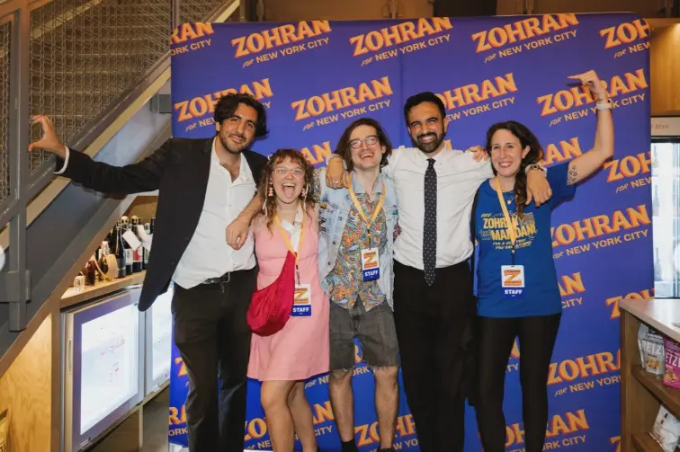
Team behind the brilliance (Source: https://www.instagram.com/p/DQLBlAFEduo/?img_index=14)
Conclusion: Design is Political
Zohran Mamdani won because he didn’t just have a platform; he had a brand identity that honored the aesthetic of the working class.
He proved that you don’t need to look “presidential” to look “powerful.” You need to look accessible. By utilizing a design system that prioritized high contrast, familiar cultural colors, and clear information hierarchy, the campaign reduced the cognitive load for voters.
At bombe.design, we take this as confirmation of our core belief: good design clarifies the complex. In this election, clarity was the ultimate winner.
Connect with us for a FREE UX Consultation, and let’s co-create meaningful impact.