
At WWDC 2025, Apple unveiled a major design overhaul for iOS 26, introducing the much-anticipated “Liquid Glass” interface. This new approach, featuring transparent menus and a distinct glassy aesthetic, is set to transform the user experience across all Apple devices, from iPhone and iPad to Mac, TV, smartwatches, and even the Vision Pro headset. But for those with long memories, this isn’t the first time glass effects have dominated tech design.
Nearly two decades ago, Microsoft’s Windows Vista debuted its Aero Glass, a design that was both lauded and criticized. As “glassmorphism” trends surge in the UX/UI industry, a crucial question emerges.
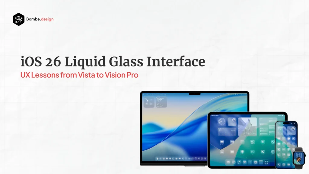
Apple’s Liquid Glass: A Design Renaissance
Apple’s “Liquid Glass” in iOS 26 is far more than just visual flair. This dynamic and innovative material actively reflects and refracts its surroundings, intelligently transforming to bring greater focus to your content. Imagine controls, navigation, app icons, and widgets gaining a new level of vibrancy, all thanks to this translucent magic.
What’s truly remarkable is how this design philosophy extends across Apple’s entire ecosystem, creating a unified and seamless experience from your iPhone to your Vision Pro. This comprehensive integration directly addresses a key criticism of past glass implementations: the frustrating lack of consistency across different platforms.
With dynamic transparency that adapts to content and context, cross-platform consistency, enhanced visual hierarchy through layered glass effects, and improved content focus via intelligent backdrop adjustments, Apple aims to redefine the glass experience.

The Windows Vista Lesson: Why Aero Glass Stumbled
The story of Windows Vista’s Aero Glass serves as a valuable cautionary tale. While visually impressive for its time, it faced significant hurdles that ultimately led to its decline. Performance and resource issues were paramount; the translucent effects demanded substantial system resources, causing frustrating UI lag, stutters, and rapid battery drain on many devices of that era.
This often forced users to revert to basic themes, creating a significant barrier to adoption and user satisfaction. Beyond performance, Aero Glass struggled with accessibility. Low contrast between text and translucent backgrounds severely hindered readability, especially for users with visual impairments.
Furthermore, inconsistent visual hierarchies across different applications created a fragmented user experience, confusing rather than delighting users. Unlike Apple’s integrated ecosystem approach, Aero Glass lacked crucial consistency, and driver instability even led to frequent crashes, eroding user trust. These shortcomings underscore a vital lesson for contemporary designers: inclusive design foresight is paramount when embracing similar visual effects.

Glassmorphism in Modern UX: The Balancing Act
Today’s glassmorphism trends bring both exciting advantages and critical challenges to the UX landscape. On the upside, it offers undeniable visual appeal, creating depth and a sophisticated look that aligns perfectly with modern UI trends. This can significantly enhance brand perception and user engagement. It also fosters spatial awareness, helping users understand content hierarchy through translucent layering. From a marketing perspective, platform differentiation is a huge win, allowing products to stand out with a sleek, high-end aesthetic.
However, the challenges are real and demand careful attention. Accessibility barriers remain a significant concern; achieving sufficient text-background contrast is inherently difficult with translucent elements, posing risks to inclusive design. Performance considerations are also present, as glass effects can still be GPU-intensive, potentially impacting older devices or slower networks. Also, ensuring usability with glassmorphism requires rigorous testing, specifically to meet WCAG 2.0 AA contrast ratio guidelines. Incorrect implementation can easily impair legibility and overall usability.
Best Practices for an Accessible Glass Future
As glassmorphism becomes a design staple, characterized by frosted blurs, translucent layers, and light reflections, its success hinges on careful implementation. Unlike the struggles of the Aero-era, today’s hardware, with its GPU acceleration and modern rendering engines, can handle these effects much more efficiently. But as performance concerns diminish, accessibility takes center stage.
For glassmorphism to be truly successful and inclusive, several best practices are essential: Contrast Management is key – using a dark background with a light overlay or vice-versa provides a strong foundation for content and boosts accessibility. Progressive Enhancement ensures that glass effects are visual enhancements that don’t compromise core functionality if disabled or unavailable. Most importantly, rigorous testing and validation across various devices, lighting conditions, and user needs are crucial to guarantee broad accessibility.
The Future of Glass Design
Apple’s “Liquid Glass” represents a concerted effort to resolve the significant challenges that plagued previous glass-based designs. By prioritizing performance optimization through tight hardware-software integration, Apple aims for a smooth user experience. Their commitment to consistent implementation across the entire ecosystem and dynamic adaptation to enhance readability and usability shows a more mature understanding of these complex challenges.
Should Apple’s “Liquid Glass” prove successful, its influence on the tech industry could be profound. We can anticipate a widespread adoption of similar transparent interfaces, potentially leading to improved accessibility standards as Apple often sets new benchmarks. Ultimately, this may foster the development of novel design patterns that skillfully balance aesthetic appeal with practical usability.
Conclusion
The return of glass effects, spearheaded by Apple’s Liquid Glass, presents both a tremendous opportunity and a significant challenge for the UX industry. While the visual appeal is undeniable, the true test lies in whether this design language can deliver accessible, inclusive experiences for all users. The lessons learned from Windows Vista’s Aero Glass are invaluable: aesthetic innovation without careful consideration of performance, accessibility, and user needs ultimately fails. Apple’s comprehensive ecosystem approach and focus on dynamic adaptation suggest a more mature understanding of these critical factors.
As designers and developers, it is our responsibility to ensure that glassmorphism enhances, rather than hinders, the user experience. This demands rigorous testing, strict adherence to accessibility guidelines, and an unwavering commitment to inclusive design practices. The glass revolution is here again, but this time, we must ensure it is built on a foundation of universal accessibility and thoughtful implementation.
At Bombe Design, we don’t just follow trends—we help define them.
As the glass revolution makes a comeback with Apple’s Liquid Glass in iOS 26, the real opportunity lies in crafting transparent interfaces that are not only beautiful—but inclusive, intuitive, and high-performing.
Whether you’re reimagining a product interface or future-proofing your brand’s visual language, our team at Bombe Design is ready to bring clarity to your innovation.
Schedule a free UX Consultation today