In our increasingly digital world, ensuring equal access to information and functionality is not just good practice—it’s essential. Web Content Accessibility Guidelines (WCAG) have emerged as the gold standard for creating digital experiences that work for everyone, regardless of their abilities or disabilities. But what exactly are these guidelines, why are they critical, and how are modern design tools like Figma evolving to support them? Let’s explore these questions in depth.
What Are WCAG Guidelines?
The Foundation of Digital Accessibility
WCAG, or Web Content Accessibility Guidelines, are a set of recommendations developed by the World Wide Web Consortium (W3C) through their Web Accessibility Initiative (WAI). These guidelines provide a comprehensive framework for making web content more accessible to people with disabilities.
The current version, WCAG 2.1 (with WCAG 2.2 recently released and WCAG 3.0 in development), is organized around four core principles, often remembered by the acronym POUR:
- Perceivable: Information and user interface components must be presentable to users in ways they can perceive. This means providing text alternatives for non-text content, captions for multimedia, adaptable content, and distinguishable elements.
- Operable: User interface components and navigation must be operable. This includes making all functionality available from a keyboard, providing users enough time to read and use content, avoiding content that could cause seizures, and offering ways to help users navigate and find content.
- Understandable: Information and the operation of the user interface must be understandable. This means making text readable and comprehensible, ensuring that content appears and operates in predictable ways, and helping users avoid and correct mistakes.
- Robust: Content must be robust enough to be interpreted reliably by a wide variety of user agents, including assistive technologies. This principle focuses on compatibility with current and future user tools.
The Three Conformance Levels
WCAG guidelines are divided into three levels of conformance:
- Level A: The most basic level of accessibility, addressing the most critical barriers for users with disabilities.
- Level AA: The standard most organizations aim for, addressing significant barriers while being reasonably achievable. Many legal requirements reference Level AA.
- Level AAA: The highest level of accessibility, providing optimal access for users with disabilities but potentially requiring significant resources to implement.
Why Should We Follow WCAG Guidelines?
Legal Mandates: Accessibility as Law
Globally, digital accessibility is legally required, not just recommended. The ADA in the U.S. and the EU’s Web Accessibility Directive mandate WCAG compliance. Countries like Canada and Australia enforce similar regulations. Legal precedents and directives make accessibility a non-negotiable for many organizations, highlighting the legal consequences of neglecting digital inclusion.
Ethical Responsibility: Inclusive Design Imperative
Designing for accessibility is an ethical must. Equal access to digital services is a fundamental right. We must prevent barriers for disabled users. Accessible design promotes digital equality, removes participation obstacles, supports information rights, and prevents discrimination. Our creations should reflect inclusivity, ensuring everyone can participate in the digital world.
Brand Reputation: Accessibility Builds Trust
Accessibility enhances brand reputation by showcasing social responsibility and ethical practices. It builds trust among diverse audiences, differentiating from competitors who neglect inclusion. Aligning with consumer values, which increasingly prioritize inclusion, is crucial. Research shows consumers favor brands mirroring their values, making accessibility a smart business decision.
Expanded Market Reach: Inclusive Digital Experiences
Organizations gain significant market reach by designing accessible digital experiences. The WHO estimates 15% of the global population lives with disabilities. Accessible design taps into this often-overlooked demographic, demonstrating corporate social responsibility and improving brand perception among all users. Inclusive design is good for business and society.
Enhanced User Experience: Accessibility for All
Accessibility improvements benefit everyone. Clear navigation aids all users, keyboard controls help power users, good color contrast improves readability, and captions assist in noisy environments. Accessibility enhances the overall user experience, making digital content more user-friendly for everyone.
SEO and Future-Proofing: Long-Term Benefits
WCAG practices align with SEO, improving search engine indexing through proper structure and alt text. Accessible content is flexible across devices, compatible with emerging technologies, easily translatable, and resilient during redesigns. Prioritizing accessibility ensures content remains usable and relevant in the long term.
How Figma’s New Updates Facilitate WCAG Compliance
Built-in Accessibility Checks: Proactive Design Compliance
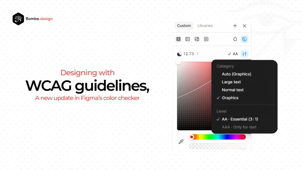
Figma’s integrated accessibility checks enable designers to verify color contrast, text readability, and touch target sizes against WCAG 2.1 standards. These automated tools provide real-time feedback, catching potential accessibility issues early. This proactive approach ensures designs are accessible from the outset, reducing the need for costly revisions later in the development process.
Enhanced Accessibility Inspector: Detailed Design Review
The updated Accessibility Inspector offers a comprehensive review panel. It aids in element role identification, ARIA attribute management, focus order visualization, and screen reader text previews. This toolset shifts accessibility from an afterthought to a core design consideration, enabling designers to meticulously refine their interfaces for optimal inclusivity.
Design System Integration: Systemic Accessibility
Figma’s component system now embeds accessibility parameters. Designers can define and enforce accessible color palettes, text styles, and interactive states within their design systems. This systematic approach ensures consistent WCAG compliance across all designs, making accessibility a fundamental part of the design process rather than a one-off effort.
Documentation and Education: Empowering Designers
Figma provides contextual help, best practice recommendations, interactive tutorials, and template libraries to educate designers on accessibility. This educational layer bridges the knowledge gap, enabling designers to effectively utilize Figma’s accessibility features. It ensures designers understand WCAG requirements and can create accessible designs independently.
Collaborative Accessibility Reviews: Team-Wide Responsibility
Figma’s collaboration tools now support accessibility reviews. Dedicated review modes, tagged comment threads, team libraries with accessible components, and handoff documentation facilitate team-wide accessibility efforts. This approach transforms accessibility into a shared responsibility, ensuring it remains a priority throughout the design process.
Prototype Testing Enhancements: Real-World Simulation
Figma’s prototyping tools include keyboard navigation simulation, screen reader previews, reduced motion options, and color blindness filters. These features allow designers to test prototypes for accessibility issues before implementation. This testing helps identify and address potential barriers, saving time and resources in development.
Developer Handoff Improvements: Seamless Implementation
Figma improves developer handoff by preserving semantic structure, including ARIA roles, highlighting alternative text, and providing accessibility annotations. These enhancements ensure that accessibility considerations are accurately translated into the final product, bridging the gap between design and development.
Practical Implementation: From Guidelines to Action
Cultivating Awareness and Education: Foundational Knowledge
Begin by fostering team understanding of accessibility fundamentals. Organize workshops and training on WCAG guidelines. Share essential resources and invite accessibility experts for consultation. Establish accessibility champions within design and development teams. This foundational knowledge ensures everyone grasps the importance and principles of inclusive design, setting the stage for effective implementation.
Integrating Accessibility into Design: Proactive Inclusion
Embed accessibility from the project’s inception. Include accessibility requirements in design briefs. Conduct thorough reviews at each milestone. Test designs with assistive technologies to identify potential barriers. Document all accessibility decisions and rationales. This proactive approach ensures accessibility is a core design principle, not an afterthought, leading to more inclusive and user-friendly products.
Leveraging Figma’s Accessibility Tools: Effective Implementation
Maximize Figma’s accessibility features by creating and maintaining an accessible component library. Establish color palettes that meet contrast requirements. Develop accessible patterns for common interactions. Utilize plugins to extend Figma’s native capabilities. These strategies ensure consistent and effective accessibility implementation, streamlining the design process and enhancing overall inclusivity.
Testing with Real Users: Authentic Feedback
Supplement automated tools with real-user testing. Recruit testers with diverse disabilities to gain authentic feedback. Observe their interactions with your designs, noting challenges and opportunities. Iterate based on their experiences. This approach provides invaluable insights, ensuring designs are not only compliant but also genuinely usable for everyone.
Documenting and Sharing Best Practices: Institutional Knowledge
Build institutional knowledge by creating organization-specific accessibility guidelines. Document successful approaches to complex accessibility challenges. Share case studies highlighting accessibility improvements. Recognize and celebrate achievements. This practice fosters a culture of continuous learning and improvement, ensuring accessibility remains a priority and becomes ingrained in the organization’s DNA.
How Bombe.design checks and implemented W3C guidelines for all client
For applications with high screen time, prioritizing WCAG compliance over mere aesthetics ensures seamless navigation for all users, including those with color blindness. This principle was crucial in our work with Binollop’s ‘Atlas,’ an AI-powered search and compliance tool designed for government contracting specialists. The platform’s complexity, combining federal databases, market intelligence, and AI functionality, demanded meticulous attention to accessibility to guarantee usability for every user.
By leveraging tools like the Figma Contrast Checker and Getstark, and adapting seamlessly to Figma’s latest accessibility-focused updates, we balanced usability and compliance. In this project, we successfully prioritized WCAG compliance, demonstrating that accessibility can be achieved without sacrificing functionality.
Choose Bombe.design for a user-centric approach to accessibility. We’re committed to ethical design and creating experiences that work for everyone, not just some. Let’s make your designs truly inclusive.
Contact Bombe.design today to learn how our integrated accessibility approach can enhance your brand and user experience.